Project 04 · Web
FVM group website
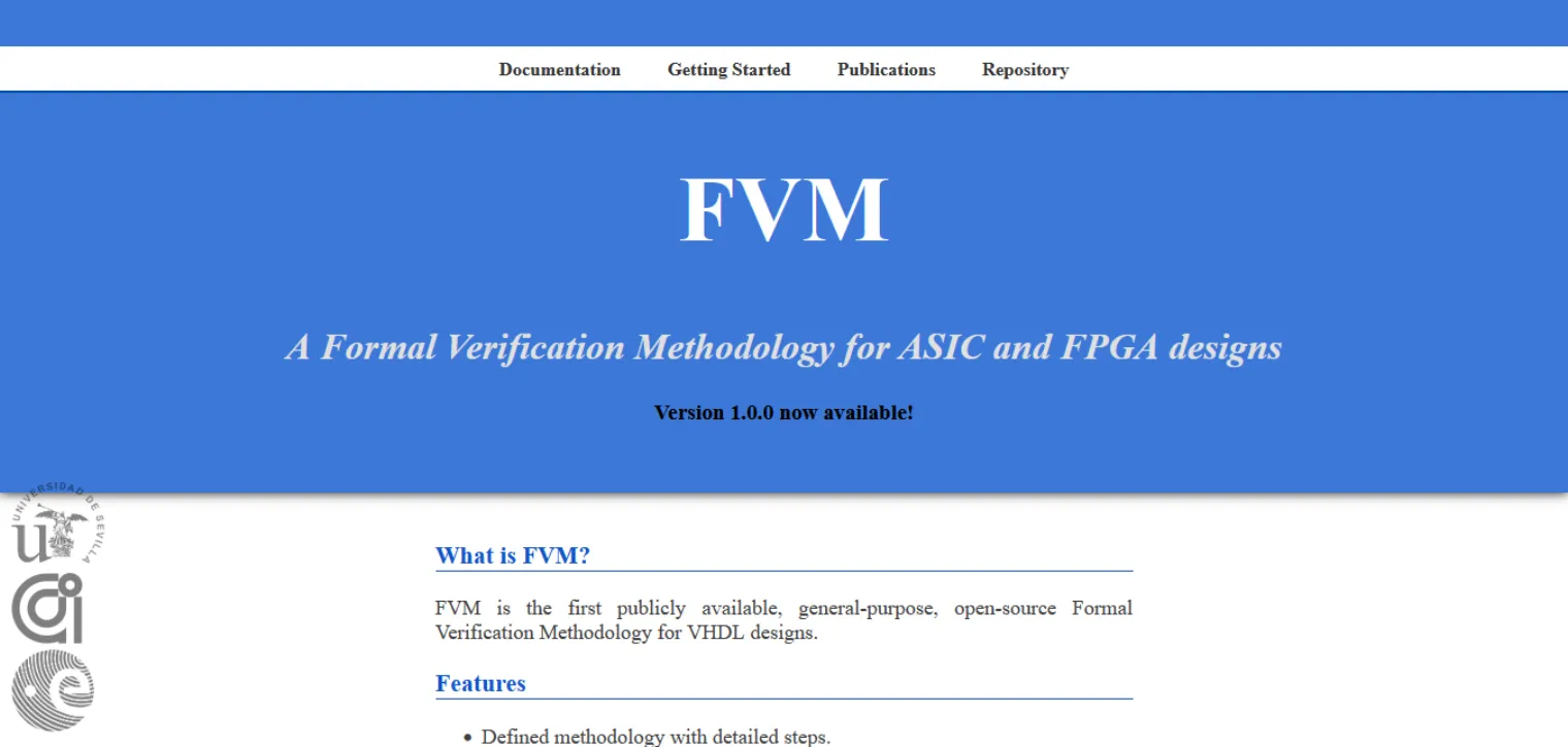
A rewrite of the landing page for FVM, an ESA-funded formal verification methodology from the Universidad de Sevilla. The old page held everything a visitor needed and surfaced none of it. Vanilla HTML, CSS and JavaScript, no framework and no build step.
Problem
Everything present, nothing surfaced
The audience is VHDL verification engineers and researchers — people who will not adopt a methodology because a page says it is good. They want to see what a property looks like, whether it has been used on anything real, and what it costs to try.
All of that existed. It was spread across the documentation and a landing page built as a flat run of headed paragraphs: what is FVM, features, who is this for, team, funding. No hierarchy, so nothing was more important than anything else. No sample of the actual work. Nothing to act on beyond a link into the docs.
Approach
Promote the evidence, add nothing
Almost no new content was written. The rewrite mostly moved facts that already existed in the documentation up to where a first-time visitor would meet them, and gave them a shape.
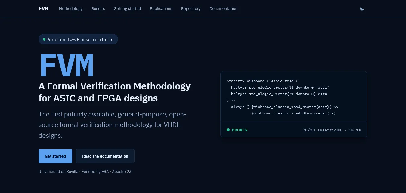
The hero now carries a real PSL property beside the pitch, with the verdict underneath it — a proof result, the assertion count, the runtime. A verification engineer can judge the methodology from that panel alone, which is the only judgement that matters to them.
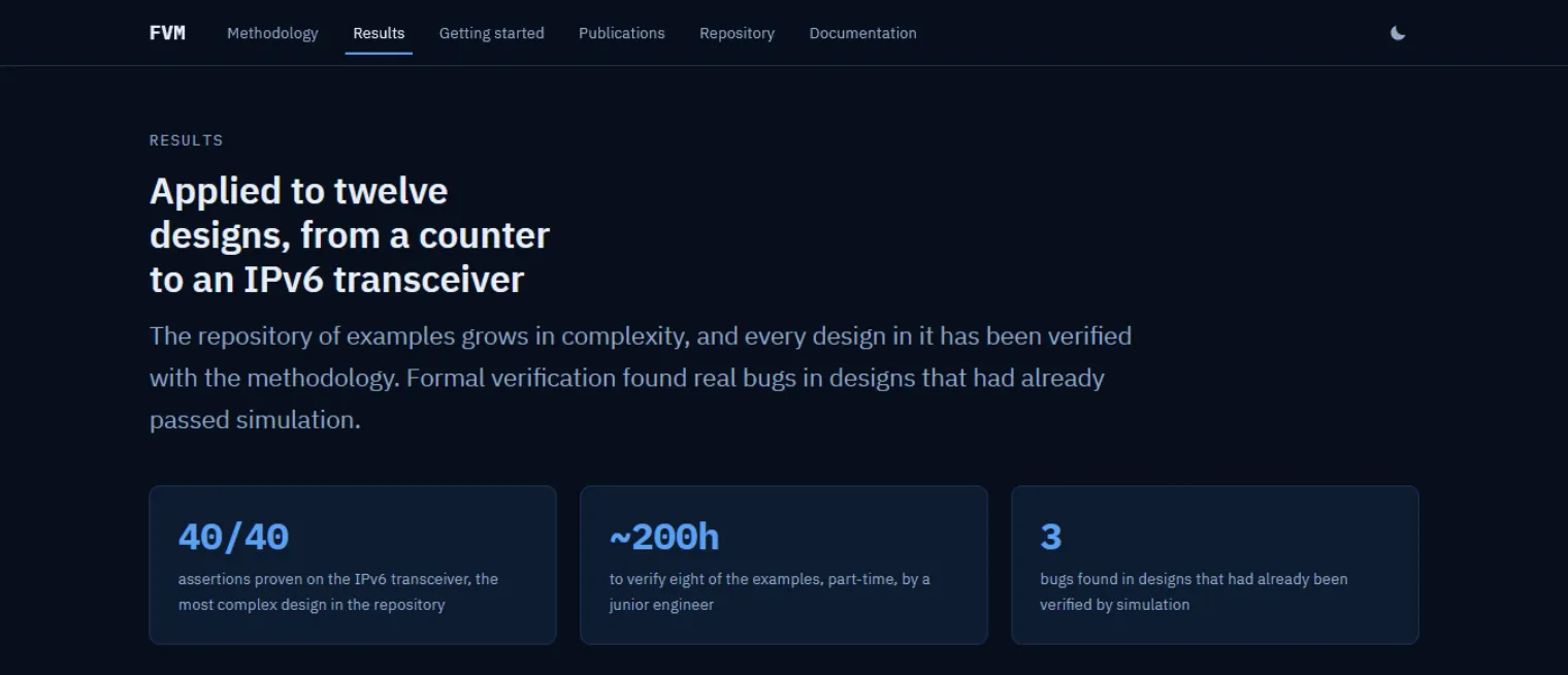
The results section does the same job with numbers that were buried in the docs: every design in the example repository verified, the assertion count on the most complex of them, the part-time hours it took a junior engineer, and the bugs found in designs that had already passed simulation. That last figure is the argument for formal verification in one line, and it was not on the site at all.
Getting started was reduced to the one command that begins everything, with a copy control beside it and the external requirements stated plainly underneath rather than discovered during an install.
Build
Maintainable by researchers
The people who will maintain this are verification researchers, not front-end developers. That ruled out a framework, a build step and a toolchain that rots between releases. It is plain HTML, CSS and JavaScript, served as files.
- Theming
- Light and dark from one token set
-
Every colour is declared once with
light-dark(). The theme script is inline in the head, ahead of the stylesheets, so the page never flashes the wrong theme before settling. - Type
- IBM Plex Sans and Mono, self-hosted
- Latin subsets under the SIL Open Font License, served from the same origin, so the page makes no third-party requests.
- Motion
- Reveal on scroll, fails safe
- The script adds the class that hides content only after confirming motion is allowed, so if it never runs the page is simply visible.
- Version
- Read live from PyPI
- The release number in the hero is fetched on load. If the request fails it keeps whatever is in the markup, so the page degrades to a stale truth rather than an empty space.
Scope
What is mine and what is not
The methodology, the tooling, the results and the paper are the work of the FVM team at the Universidad de Sevilla, supported by the European Space Agency. I designed and built the landing page around them. The documentation site is separate and was left alone.
The rewrite currently runs on the GitLab mirror. It replaces the page at the official domain in September.